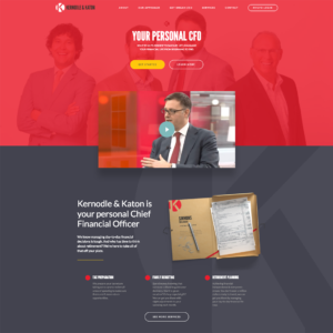
 Kernodle & Katon is a wealth management company from the Little Rock, Arkansas area. While working at Perch, I was the sole developer to work on this web site project. While wealth management companies usually go with pretty basic (read as: boring) designs, Kernodle & Katon was open to a more colorful and unique design, which made development pretty fun.
While it was a fairly simple site, we always made client sites as customizable as possible. The goal was to get a user-friendly structure built in the backend that would allow the client to edit EVERYTHING they would ever need to. This saves them from having to pay us to go in and make small changes, and it saved us from having to go and schedule blocks of time out for changes that could potentially be happening VERY often.
Even though it was a basic site, I still had to build out a way for them to be able to add and edit services, staff members, and locations. They also needed to be able to edit the contact form and the usual content needs.
I decided that WordPress would be a good fit, and I’d use a few select plugins to assist with the admin area structure. I used Advanced Custom Fields, along with some add-ons that would allow the client to edit global options, as well as enabling them to edit all the content used throughout the site. I also used custom post types for the staff, services, and locations. It may have been a little overkill, but I thought that if we ever needed to use the post types on different pages or for different uses down the road, they’d already be available at a more global level through WordPress. We used Contact Form 7 for the contact form so that Kernodle & Katon could edit it easily.
 There were a few small design features I especially liked on this site, such as the hover effect on the homepage. Hovering over images of the senior partners had a subtle fade-in effect that showed more information and provided links to their personal staff info section.
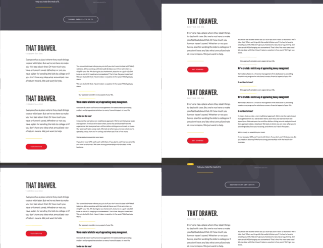
 I also liked the fixed sidebar that was designed for pages and articles. It provided a call to action for users, and it definitely grabbed their attention on scroll.
Overall it was a quick, fun project and it was nice to be able to work on a design for a client like Kernodle & Katon who weren’t afraid to get a little creative with their web presence.


