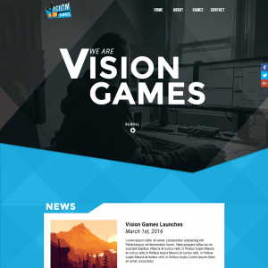
 Vision Games is a small game agency consisting of two friends out of New England in the states. We had all worked together at one point, and when they started looking to develop their new web presence they reached out.
They were in the process of building out their first game, and wanted an informational site to present to investors and others that were interested in their coming title. While it was to be pretty basic to start, they wanted it to be built to scale; where they could add in information on future games and any news that they wanted to share.
They had a logo and some basic branding styles, so after meeting with them and discussing their needs, I got to work. I laid out a design that had some tech-scene elements but also retained the ‘fun’ look of their existing branding and logo. After going through a few revisions, we landed on the option you see today.
To keep costs down, they mostly wanted to just have a one-page layout to start and they weren’t too concerned with responsiveness and mobile views at the time. But I ended up adding in a little bit for posts/game views and also some responsiveness free-of-charge as it’s important for all modern websites to address these issues. In fact, moving forward, all quotes of mine now include mobile designs and development.
While there hasn’t been a need to expand the site more yet, I’m looking forward to working with Vision Games on their next phase!


